EXPLORATIONS
A somewhat diverse collection of map, all exploring in a different way our planet with a touch of poetry and wonder, using real life data and concepts from geography
For the map galery dedicated to South Asia, click here
Where Scandinavia begins
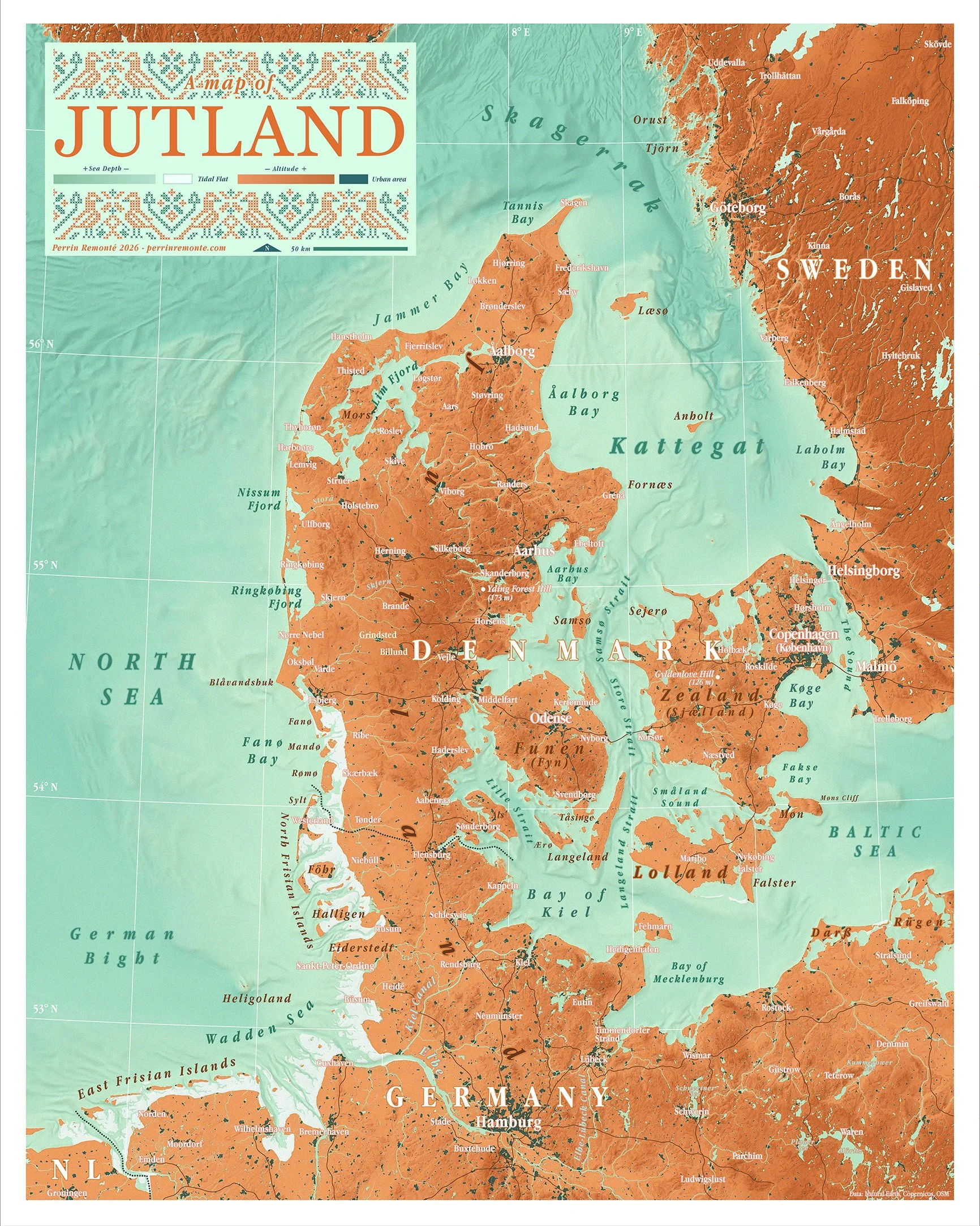
After visiting Denmark, and more recently Hamburg and Lübeck, I simply couldn't resist the urge to map this unique peninsula—one that is surprisingly overlooked as a geographical entity in its own right!
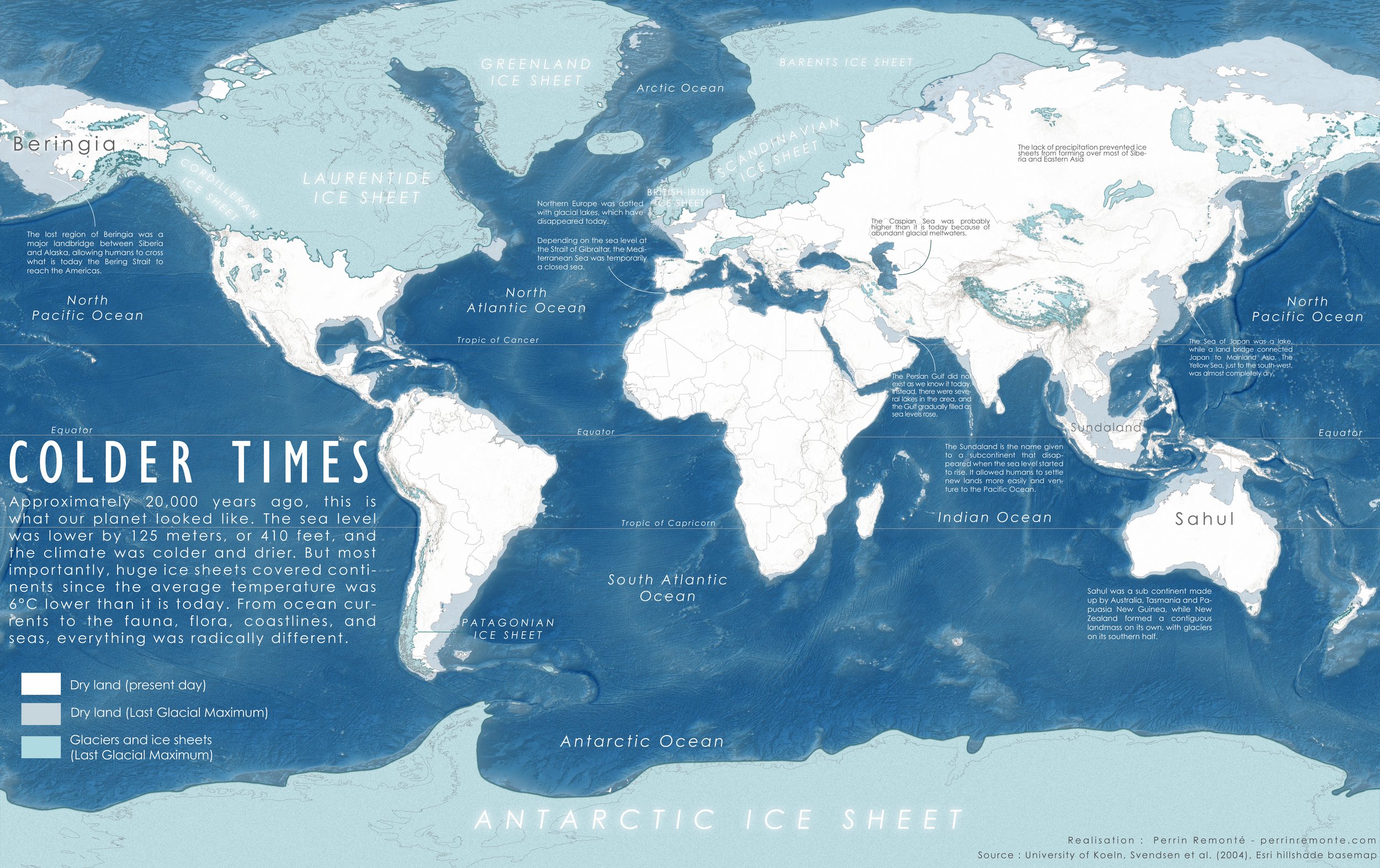
Jutland is where Scandinavia begins, and where the vast ice sheet that once covered northern Europe extended and retreated 20,000 years ago. Today, shared between Germany and Denmark, the peninsula is relatively densely populated and closely connected to the rest of Europe through an extensive network of roads, waterways, ports, and ferry routes.
Yet the region has retained its peaceful character, with villages of warm brick churches and weathered copper roofs that inspired the colour palette of this map.
Jutland is also one of Europe's greatest bird sanctuaries—a bridge and a refuge for migratory birds travelling between the Nordic world and more southern latitudes. The mudflats of the Wadden Sea are among the continent's most remarkable natural landscapes, inspiring the traditional Danish embroidery motif woven into the design of this map.
Circumnavigating the Baltic Sea
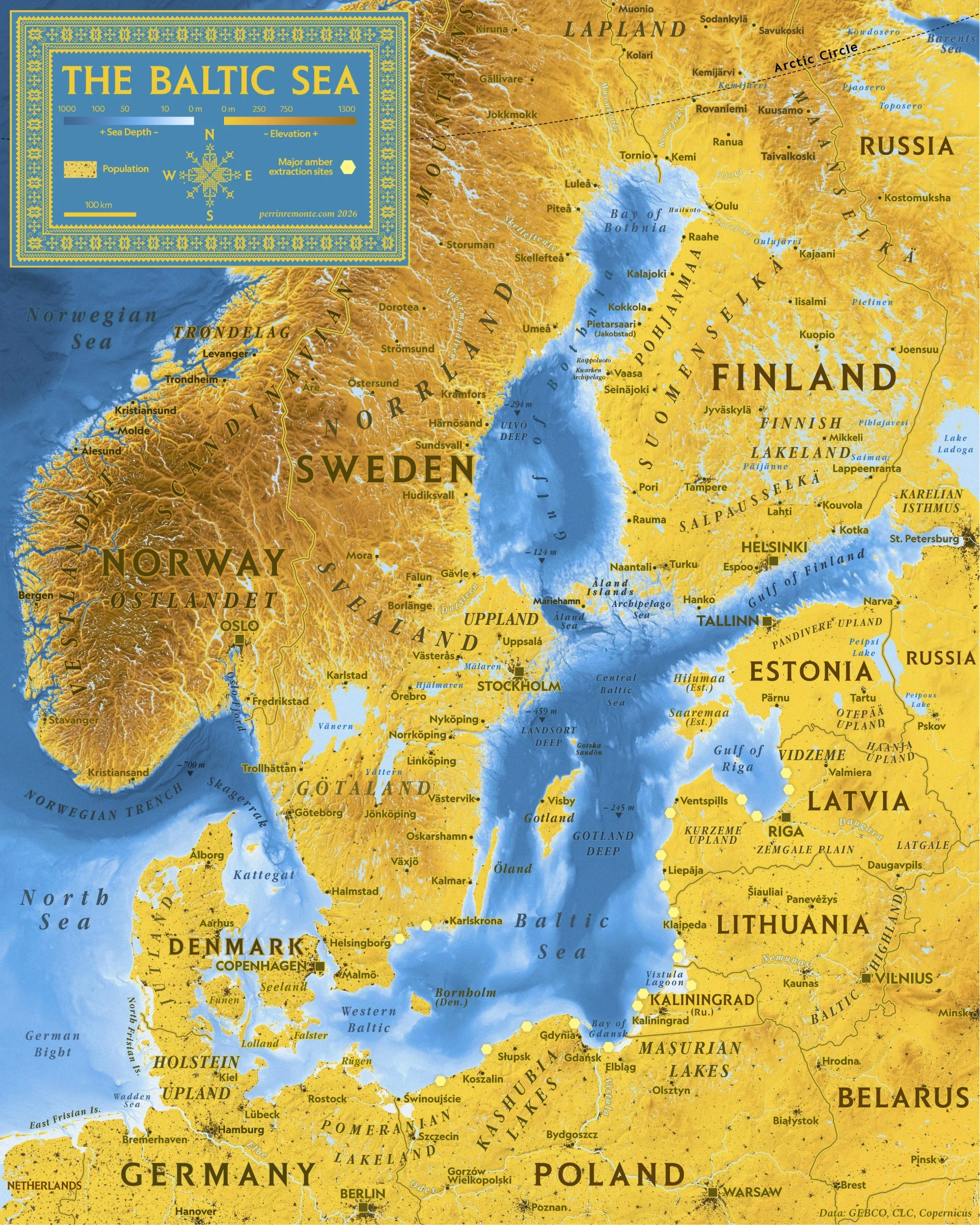
In July 2026, I travelled all the way to the Arctic Circle by train, from Paris to Stockholm while hugging the Baltic shore : Lübeck, Gdansk, Riga, Tallinn, Helsinki, Oulu — the list goes on — and an experience of this magnitude calls for a map.
This one here shows the Baltic Sea and borrows its warm and deep hues from amber, the most famous export of the region, a luxury that made the region rich and famous. This mineral-like substance formed millions of years ago from tree resin and it is today extracted on the shores of the baltic, making the two deep intertwined, geographically and historically.
On the other hand, a rich blue gradient shows in great detail the bathymetry of the Baltic Sea, from the very shallow and frigid waters of the Gulf of Finland that freeze every winter, to the deep areas of the central area, off Gotland and the sandy shores of the lagoons found along Poland or Kaliningrad.
Traditionnal embroidery patterns from Lithuania featured on the map also echo another facet of the rich culture of the region, by paying tribute to this ancient and important craftmanship.
Scotland but… make it desi!
Three years ago, we set off on a five-week journey to the United Kingdom from Brittany with one simple goal: reaching the Scottish Highlands in my tiny Toyota Aygo.
It was just before what would, in retrospect, become the best trip of my life that I began making my very first maps. Naturally, when I returned home, I was seized by an overwhelming urge to create a large map of Scotland.
Let me tell you: there’s nothing like the high you get by making a very detailed map of the place you’ve just come back from. I did make the map at the time.
in June 2026, 3 years later, while leafing through my Atlas of Remote Islands and coming across the island of St Kilda, I suddenly felt compelled to map this beautiful country once again, this time from a very different perspective, based on some experience during that trip, and later.
One distinct memory I have is stopping by to eat in a restaurant, on the way out of Skye, that looked perfectly scottish and traditional from outside. We got inside, starving after three days of strenuous hikes and were greeted by the staff that was entirely south asian. They gave us the menu and everything was also food from India or Pakistan.
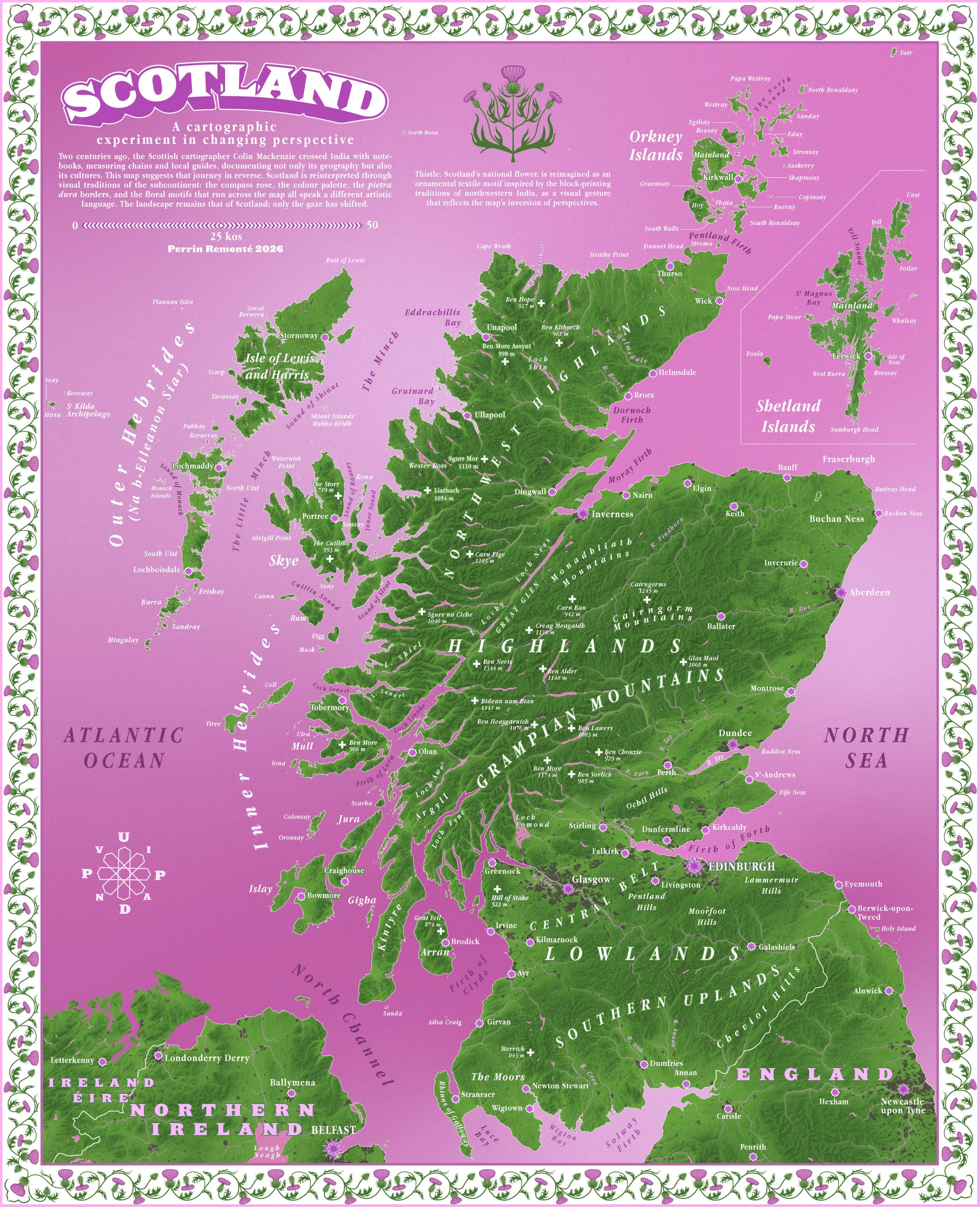
We were delighted and proceeded to create the most enormous restaurant bill of the whole trip. There is just something fascinating about the way cultures meet and people blend and this map is an experiment suggesting something similar.
The map blends a South Asian, desi, visual inspiration — the colour palette, the floral motif running along the frame in a typical pietra dura, like one you’d find in Agra, Delhi or Lahore, the windrose and more — while depicting Scotland and its national flower, the thistle.
A 600 million-year story
A major new geo-sports event has been launched! Over 2,500 km across the country, cycling through France’s most iconic geographical landmarks and experiencing the vast majority of the country’s soil types.
This journey I’m proposing isn’t just a journey through space: it starts in Brest and ends in the Calanques, passing through Paris—but it’s also a true journey through time: you will traverse the history of our country, spanning hundreds of millions of years of ceaseless plate tectonics, rumbling volcanoes, tropical seas covering lands that are now above water, magmatic, plutonic, and sedimentary rocks, as well as sharp ridges and mountains alongside older, more rounded ones.
A non-exhaustive list of things to see (there are 30 stops): The Monts d’Arrée, among the oldest in France; the Boucles de la Seine Park; the limestone cliffs of the Mâconnais; the highest peak in Europe; the Colorado Provençal; and even extinct volcanoes covered in ancient trees, whose very ancestors appeared on Earth after the oldest rocks in our country...
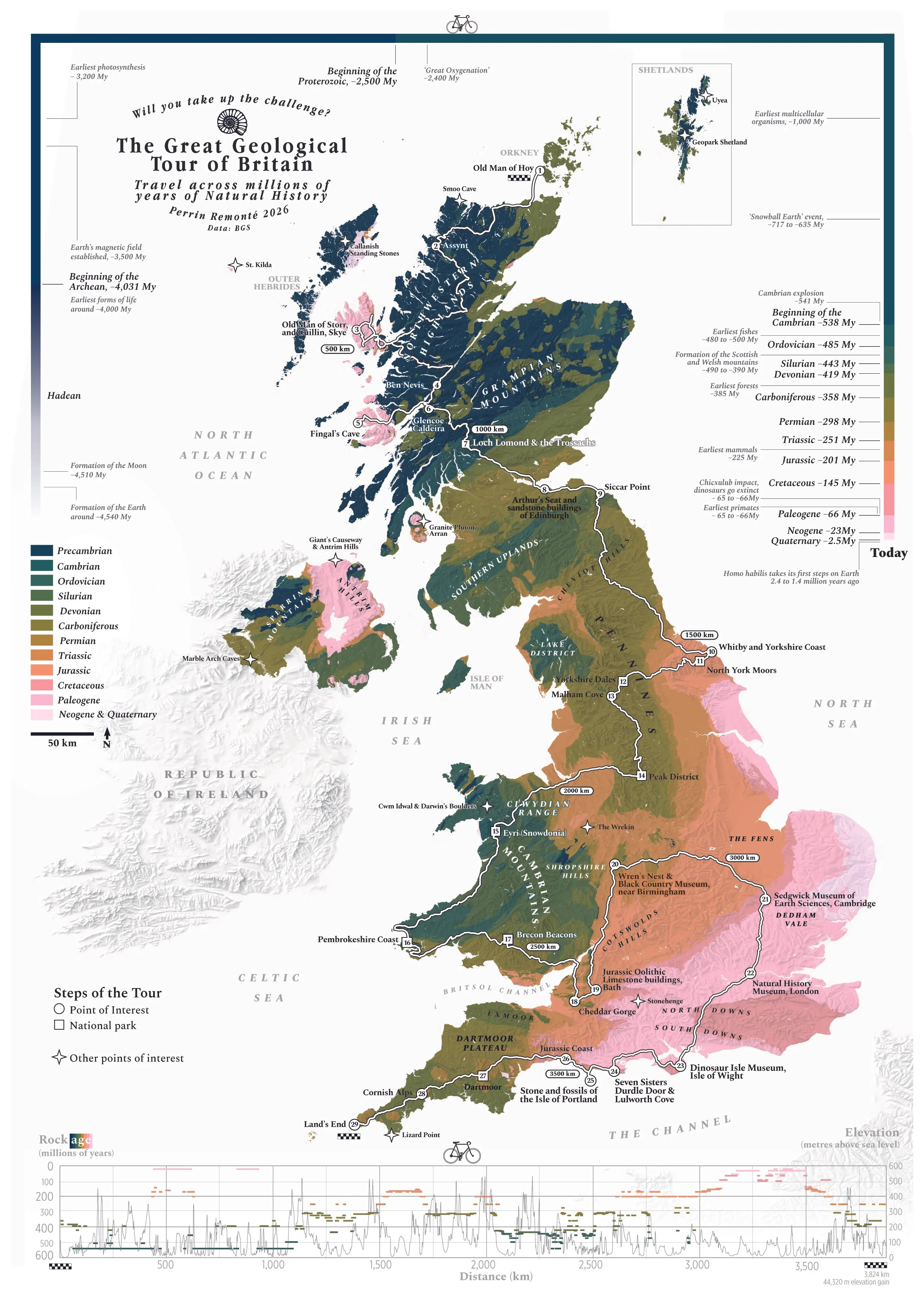
The map does not follow the international color convention for displaying geological layers, as it focuses more on the age of the rocks rather than their nature (sandstone, quartz, shale, sediments, etc.)
To obtain this level of detail, a traditional geological map remains a must have.
I couldn’t resist and made of for Great Britain – it is the birthplace of geology after all!

What are the most populous climates?
What kinds of climates do the 8 billion people we share this planet with actually live in? Which climates are the most populated, the most densely settled? And, more fundamentally, how many climates are there?
To begin with, how many climates are there on Earth, really? It’s not an easy question. Putting labels on something as complex as a combination of monthly temperatures and precipitation quickly gets messy. At one end of the spectrum, you have polar climates; at the other, equatorial ones.
The most widely known and commonly used classification today is Köppen’s. In 1900, this German botanist came up with the elegant idea of defining 30 climate categories, each identified by a three-letter code. The first letter (A, B, C, D, or E) provides a broad grouping of the world’s climates: tropical, arid, temperate, continental, and polar, based on temperature and precipitation. The second letter (which refines the first) describes rainfall patterns: the driest and wettest months, whether there is a dry season or not, how humid it is, and so on.
The third letter, meanwhile, describes temperature, based on the coldest or warmest month and just how cold—or hot—that month gets. Put together, these three letters give us 30 climate types that capture the full range of climates on Earth with a fair degree of clarity and precision—not a small achievement.
With this classification in hand, along with global population data, we can use my go-to GIS software (QGIS) to map how people are distributed across these climates worldwide. It takes a bit of data wrangling—and some rigor, given the size of the datasets—but the result comes together quite neatly.
And here it is! So, what do we see?
The top three: the tropical savanna climate (Aw) is the most populated on Earth, home to around 1.6 billion people—a large part of Brazil, India, and tropical Africa. Next comes the humid subtropical monsoon climate (Cwa), with just over 1.1 billion people spread across northern India, Mexico, inland China, and a small part of Brazil. In third place is the humid subtropical climate (Cfa), found in the southern United States, eastern China, southern Brazil, and parts of Australia.
When it comes to the most densely populated climates, though, the picture looks quite different… I’ll let you explore that for yourself.

Temperate rainforests from the future
Maybe, like me, you’ve found yourself daydreaming about the temperate rainforests around Vancouver, in New Zealand, or in Chile—those landscapes washed in deep greens, with mist clinging to the canopy, giant ferns unfurling beneath, and moss carpeting everything, still damp from the last rain.
What if we gave ourselves 700 years to bring something like that back here? What would we actually need? Rain—lots of it. Mild temperatures, relatively cool and humid summers, time… and more rain (above all, a lot of rainy days).
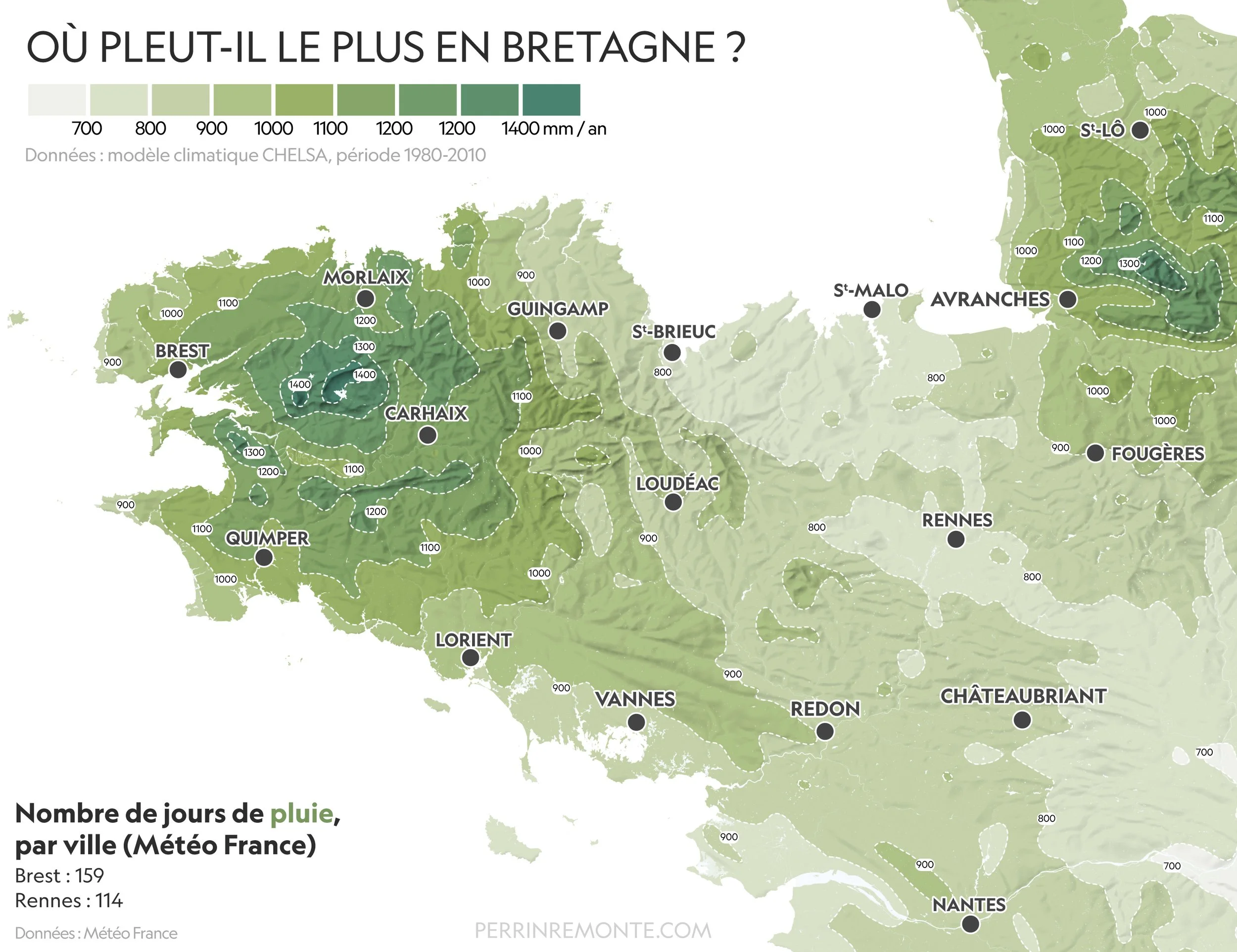
I mapped data from a climate model to visualize rainfall in Brittany, looking at total annual precipitation. It gives a rough sense of what our future temperate rainforests might look like—their extent, their distribution, or at least where they once stood, back when the region was entirely forested. Though, to be fair, I did leave out one key ingredient from my list: time. A lot of time.
As Francis Hallé and the Association Francis Hallé pour la forêt primaire explain, it would take around 700 years for a primary forest to develop in our latitudes. The biological constraints that govern my own lifespan (and you’re probably in the same situation) mean I won’t get to see such a forest return to Brittany—but I’d love to. And beyond time, there’s another small detail we’re still missing: space.
If these forests remain extensive in their “twin” regions—climatically speaking—in Canada or New Zealand, it’s largely because agriculture arrived later there, and protections were put in place before these ancient forests were entirely lost to human activity. They are still shrinking today, but they’ve long since disappeared in France—for good.
Ten thousand years ago, about two-thirds of the world’s habitable land was covered in forests. Today, that figure has dropped to just one-third—the land-hungry expansion of Homo sapiens agriculture has seen to that.
If we want to reverse the trend, we need both time and space. In metropolitan France, more than 40% of arable land is devoted to livestock farming—a reasonable place to start, perhaps? We can also work to slow the degradation of our existing forests—pests, fires, and the northward shift of species—all changes observed by the Office National des Forêts and driven largely by climate change.
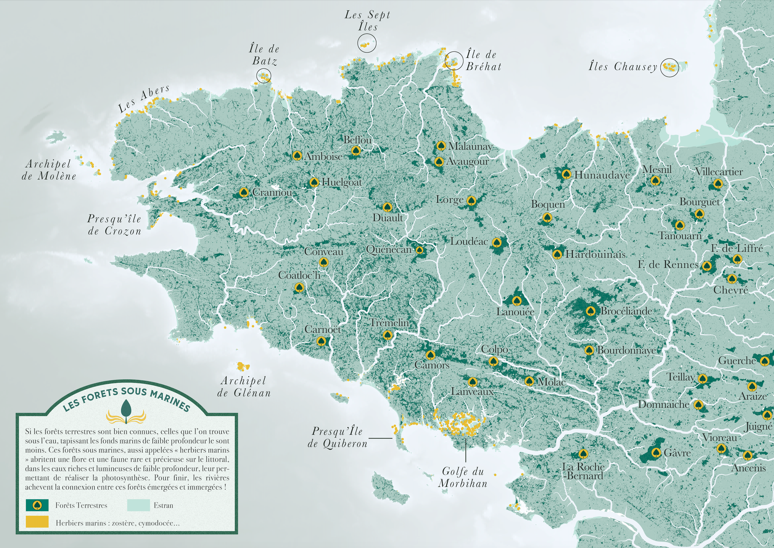
While we wait for those 700 years to pass, here are a few glimpses of the beautiful fragments of (fairly) old forest that still remain in Brittany. To me, they echo their distant ancestors—landscapes that have now disappeared, but that we might one day bring back.
I went looking across Brittany for some of these emerald fragments that already give us a sense of what these potential forests could look like. You can explore the full photo gallery here.


Shifting our focus to make the shift?
Shifting our focus to make the shift? In cartography, the ocean is often the great afterthought—or even the victim—of modern maps. Despite covering more than 70% of our planet (which makes the irony hard to miss), it’s frequently split in two (the usual casualty: the Pacific Ocean), or stretched, distorted, and chopped up (often at the expense of the polar seas). The result: oceans appear separate and disconnected. It’s not easy to find maps that truly give pride of place to the “Great Blue.”
There are a few ways to address this. One is to center the world map on the Pacific Ocean (which ends up splitting what lies south of Africa—a lesser evil). Another is to use a polar projection, which allows for a more faithful representation of those vast, icy waters that regulate the climate and are at the heart of so many global challenges today (with the Earth seen from “above” or “below”).
Of course, these projections are imperfect—spoiler: they all are. But there is one that may be a little less so when it comes to representing not just the oceans, but the ocean as a whole: the Spilhaus projection.
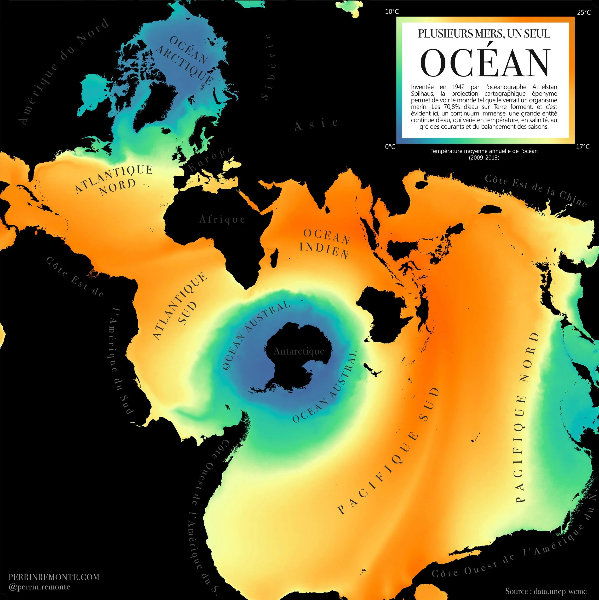
This curiosity—a small gem of lines and calculations—is as much mathematical as it is cartographic. After all, cartography is, at its core, mathematics—something we modern mapmakers can mostly leave to computers. It’s no coincidence that this projection was devised by the South African–American oceanographer and geophysicist Athelstan Spilhaus (1911–1998).
Mapped out, it reveals the ocean as a continuous, unbroken expanse: a vast space of exchange—maritime routes, cultural connections, heat transfer, flows of biodiversity. Land is pushed into the background, distorted and confined to the edges. The roles are reversed. Continents become margins, boundaries.
Living by the sea, especially in a place like Brest, in my case, it feels almost natural—even desirable—to see the ocean not as an ending, but as a beginning. Not the edge of land, but an opening.
Here, I’m presenting a simple yet fundamental dataset: sea surface temperature, taking shape in a form made unique by this projection.
As the tide goes
How do you like your tides? Almost nonexistent, like in Marseille or Stockholm, or truly massive, like in Bristol, Saint-Malo, or at the far end of the Bay of Fundy in Canada?

Personally, I grew up about 30 minutes from Saint-Malo, so going to the Mediterranean is always a slightly disorienting experience for me.
Tides also come with a whole vocabulary that feels deeply rooted in the sea. There’s flot and jusant—the rising and falling tidal currents—which become especially strong during mortes-eaux and vives-eaux, meaning periods of weak or strong tidal ranges, depending on the lunar cycle.
The estran, meanwhile, is the intertidal zone revealed and covered again each day by the tide: a fascinating microcosm stretching across thousands of kilometres. At the peak of the tide—its highest or lowest point in the daily cycle—we speak of étale, when the curve of the tide briefly flattens before changing direction.
Yes, tides are, above all, mathematics.
And depending on where you are on Earth, tides can follow a diurnal rhythm (one rise and fall per day) or a semi-diurnal one, with two full cycles each day.
This marine dance plays a key role in many things: fishing, navigation, and wildlife, for example. If you go to Brittany or Normandy at low tide—at étale, you’ve got it—and there are rocky shores around, you’ll notice the seaweeds clinging to the rocks are arranged in distinct layers.
The highest algae are those that can tolerate a more air-exposed life than a fully marine one, while those at the base prefer to stay submerged most of the time. Between these extremes, there’s a whole gradient of algae and seagrasses living just below the lowest water line.
Marine animals, for their part, follow biological rhythms tuned to the tides (in addition to the circadian cycle we share, linked to the sun). In many ways, the tidal rhythm is even more important to them than daylight.
While you wait for your next intertidal excursion—the estran—here are a few maps to help you prepare.